-
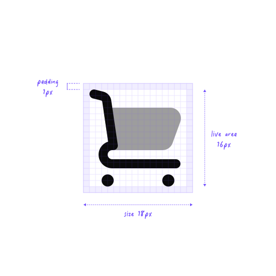
UI icons are drawn on an 18px grid with a 16px live area, sized to sit next to 14–16px interface text. A 12px subset covers the tightest spots, like inputs, table cells, and inline labels. -
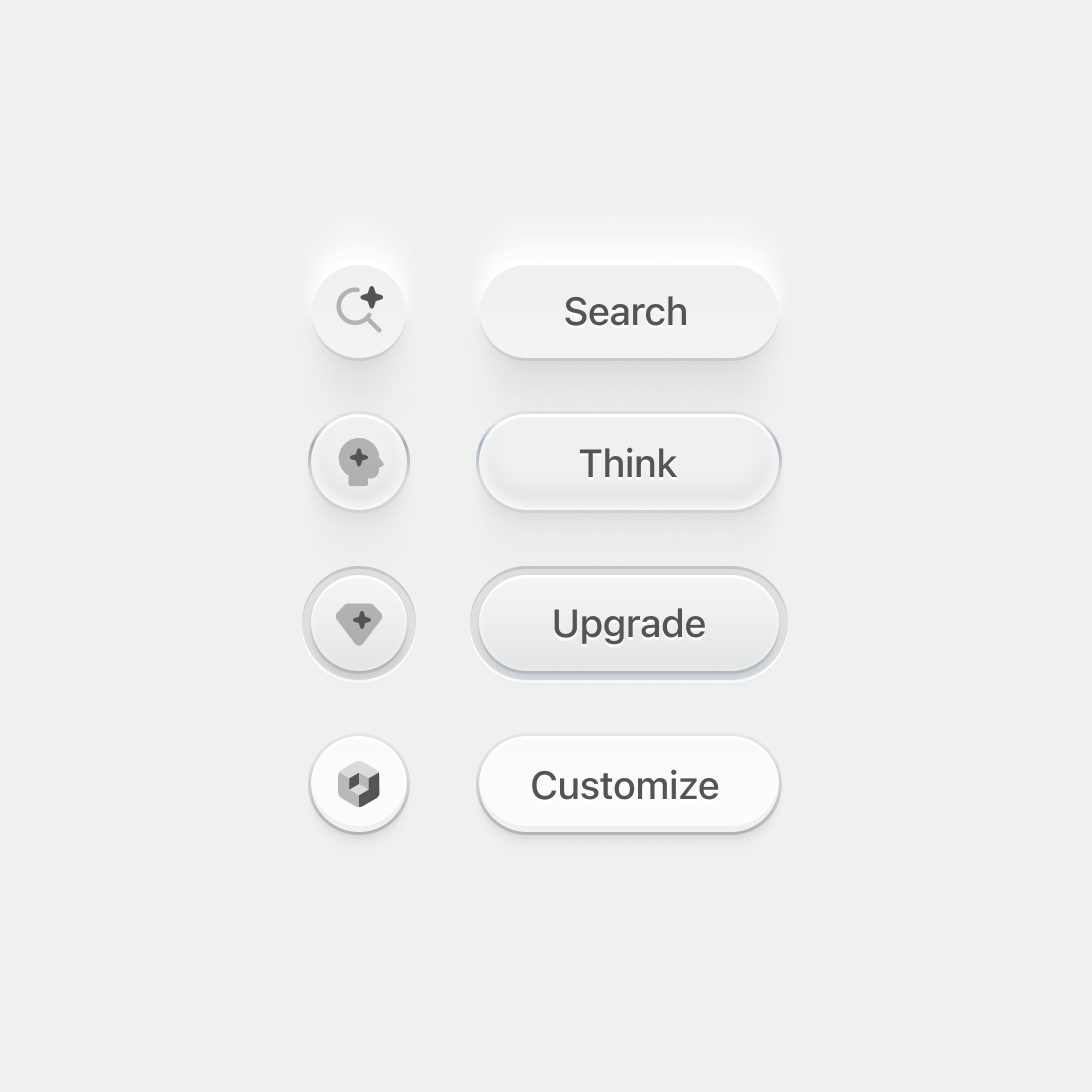
Nucleo UI icons are drawn at 18px to fit standard button sizes. -
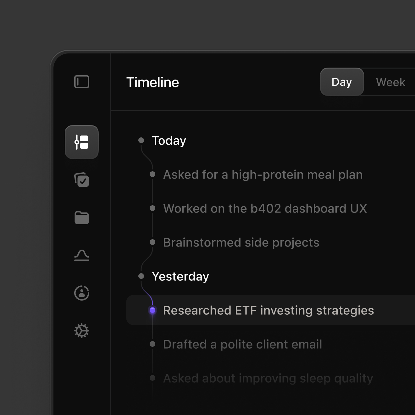
The right icon makes a screen easier to scan. Timeline, tasks, files, and settings stay recognizable in the sidebar, so you know where you are before you read the list.
-
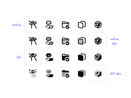
Switch between four matching styles to show state, like an outline icon that turns solid when selected. You can adjust the stroke width of outline icons and the opacity of duotone layers in the web app. -
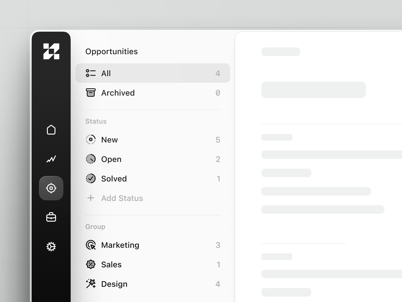
The same icons work in a sidebar and a filter list, from a compact icon rail to rows like All, Archived, and Solved. At 18px they sit flush with the label, so navigation stays easy to scan. -
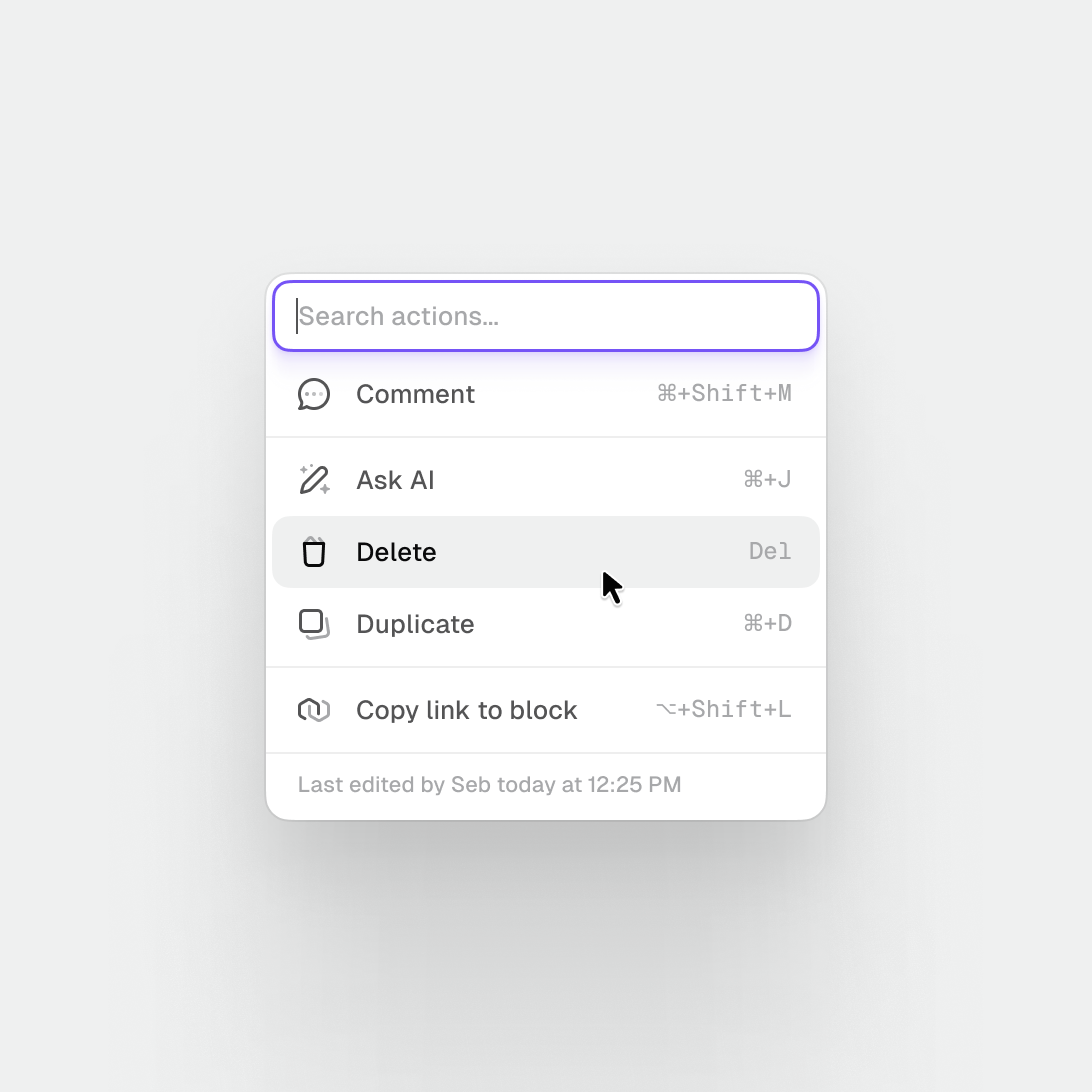
UI icons are sized for menus and command palettes, where each action pairs an 18px icon with a label and a keyboard shortcut. The stroke stays even at that size, so Comment, Delete, and Duplicate stay clear in a dense list.