Developer-friendly
Nucleo React Packages
Install our packages to easily import our icons in your React projects.
Icon Family
Installation
# set your license key first
export NUCLEO_LICENSE_KEY=your-license-key

# then install one of the Nucleo Core packages
npm install nucleo-core-fill-24
Here's the list of available packages for the Nucleo Core icons:
| Package | Style | Size |
|---|---|---|
| nucleo-core-fill-24 | Filled | 24px |
| nucleo-core-outline-24 | Outline | 24px |
| nucleo-core-fill-32 | Filled | 32px |
| nucleo-core-outline-32 | Outline | 32px |
| nucleo-core-fill-48 | Filled | 48px |
| nucleo-core-outline-48 | Outline | 48px |
These are private packages, so you'll need to purchase the Nucleo Core icons to install it. You can find your license key on your account page.
CI Environments
If you're using a CI service (such as Vercel, Netlify, GitHub Actions, etc.), make sure to add your Nucleo license key as an environment variable.
Set a variable named NUCLEO_LICENSE_KEY with your license key value to ensure the CLI can authenticate correctly during deployment.
Usage
import { IconAccessibilityFill48 } from "nucleo-core-fill-48";
function MyComponent() {
return <IconAccessibilityFill48/>;
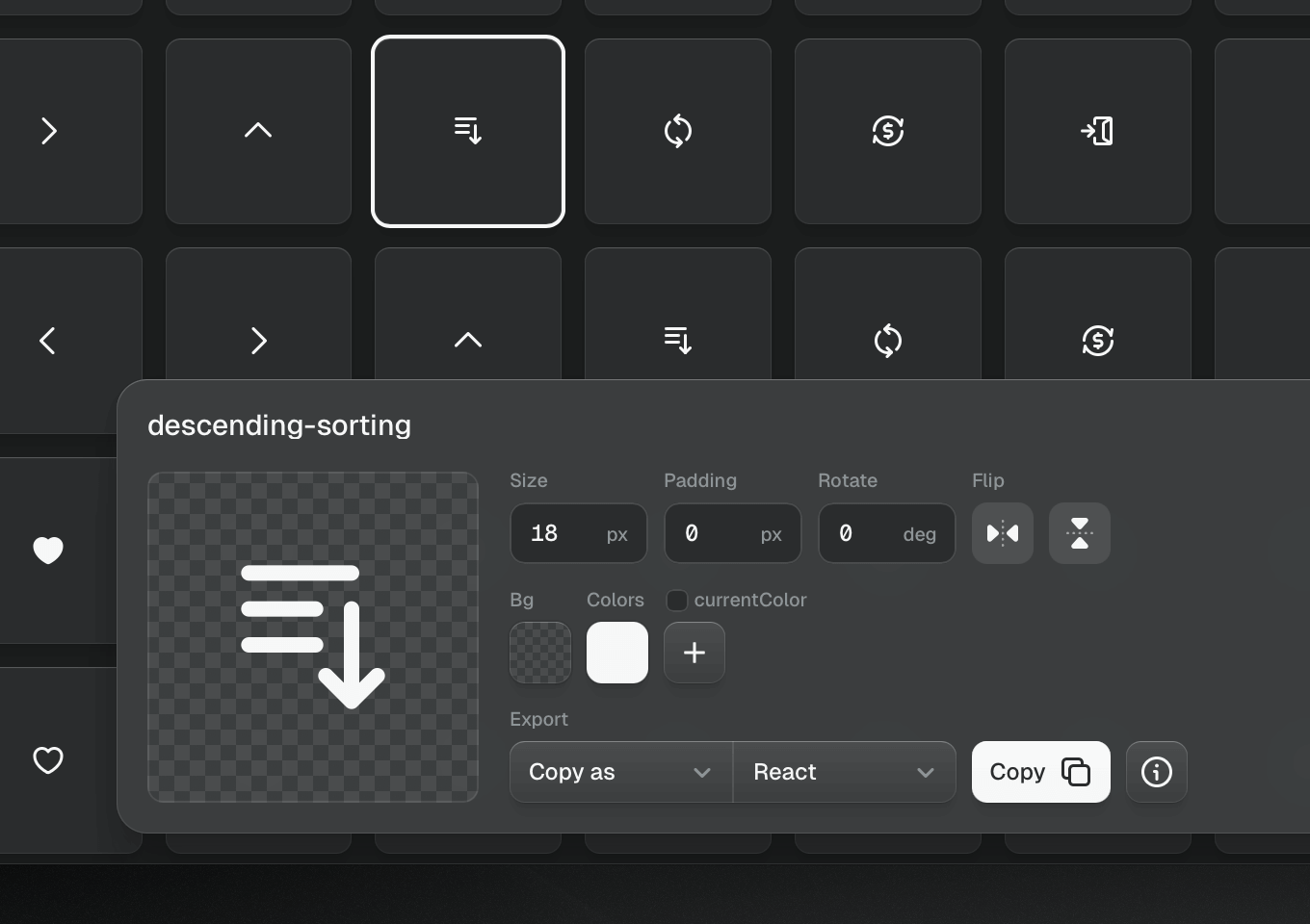
}Browse the full list of available icons on the Nucleo Web App.
Free Preview
If you'd like to try the package before purchasing the icons, you can install one of the Nucleo Core Essential packages instead:
| Style | Essential Package |
|---|---|
| 24px Fill | nucleo-core-essential-fill-24 |
| 24px Outline | nucleo-core-essential-outline-24 |
| 32px Fill | nucleo-core-essential-fill-32 |
| 32px Outline | nucleo-core-essential-outline-32 |
| 48px Fill | nucleo-core-essential-fill-48 |
| 48px Outline | nucleo-core-essential-outline-48 |
Customization
Icon Size
You can set a custom size using the size prop:
<IconAccessibilityFill48 size={32}/>Alternatively, use CSS utility classes. For example, if using Tailwind CSS:
<IconAccessibilityFill48 className="size-8"/>Icon Colors
Use CSS utility classes to customize the icon color too. For example, if using Tailwind CSS:
<IconAccessibilityFill48 className="text-[blue]"/>Icon Secondary Color
The Nucleo Core icons support a secondary color. To customize the secondary color, target the elements inside the SVG that have the data-color="color-2" attribute.
For example, if using Tailwind CSS:
{/* primary color -> blue, secondary color -> red */}
<IconAccessibilityFill48 className="text-[blue] **:data-[color="color-2"]:text-[red]"/>
Icon Stroke Width
For outline icons, the default stroke-width is 2px. You can customize it using the strokeWidth prop:
import { IconAccessibilityOutline48 } from "nucleo-core-outline-48";

function MyComponent() {
  return <IconAccessibilityOutline48 strokeWidth={1.5}/>;
}
Icon Corners
Outline icons have squared corners by default. You can round them by using the corners prop:
import { IconAccessibilityOutline48 } from "nucleo-core-outline-48";

function MyComponent() {
  return <IconAccessibilityOutline48 corners='round'/>;
}
Accessibility
To improve your icons accessibility, you can either add a title or use the aria-label attribute:
{/* use the title attribute */}
<IconAccessibilityFill48 title="accessibility label"/>

{/* or use the aria-label attribute */}
<IconAccessibilityFill48 aria-label="accessibility label"/>
If you want to hide the icon from screen readers, you can use the aria-hidden attribute:
<IconAccessibilityFill48 aria-hidden={true}/>License
Refer to the Nucleo Icons License for more information.
Installation
# set your license key first
export NUCLEO_LICENSE_KEY=your-license-key

# then install one of the Nucleo UI packages
npm install nucleo-ui-fill-18
Here's the list of available packages for the Nucleo UI icons:
| Package | Style | Size |
|---|---|---|
| nucleo-ui-fill-12 | Filled | 12px |
| nucleo-ui-outline-12 | Outline | 12px |
| nucleo-ui-fill-18 | Filled | 18px |
| nucleo-ui-fill-duo-18 | Filled Duotone | 18px |
| nucleo-ui-outline-18 | Outline | 18px |
| nucleo-ui-outline-duo-18 | Outline Duotone | 18px |
These are private packages, so you'll need to purchase the Nucleo UI icons to install it. You can find your license key on your account page.
CI Environments
If you're using a CI service (such as Vercel, Netlify, GitHub Actions, etc.), make sure to add your Nucleo license key as an environment variable.
Set a variable named NUCLEO_LICENSE_KEY with your license key value to ensure the CLI can authenticate correctly during deployment.
Usage
import { IconAccessibilityFill18 } from "nucleo-ui-fill-18";

function MyComponent() {
  return <IconAccessibilityFill18/>;
}
Browse the full list of available icons on the Nucleo Web App.
Free Preview
If you'd like to try the package before purchasing the icons, you can install one of the Nucleo UI Essential packages instead:
| Style | Essential Package |
|---|---|
| 12px Fill | nucleo-ui-essential-fill-12 |
| 12px Outline | nucleo-ui-essential-outline-12 |
| 18px Fill | nucleo-ui-essential-fill-18 |
| 18px Fill Duo | nucleo-ui-essential-fill-duo-18 |
| 18px Outline | nucleo-ui-essential-outline-18 |
| 18px Outline Duo | nucleo-ui-essential-outline-duo-18 |
Customization
Icon Size
You can set a custom size using the size prop:
<IconAccessibilityFill18 size={32}/>Alternatively, use CSS utility classes. For example, if using Tailwind CSS:
<IconAccessibilityFill18 className="size-8"/>Icon Colors
Use CSS utility classes to customize the icon color too. For example, if using Tailwind CSS:
<IconAccessibilityFill18 className="text-[blue]"/>Icon Secondary Color
The Nucleo UI icons support a secondary color. To customize the secondary color, target the elements inside the SVG that have the data-color="color-2" attribute.
For example, if using Tailwind CSS:
{/* primary color -> blue, secondary color -> red */}
<IconAccessibilityFill18 className="text-[blue] **:data-[color="color-2"]:text-[red]"/>
Icon Stroke Width
For outline icons, the default stroke-width is 1.5px. You can customize it using the strokeWidth prop:
import { IconAccessibilityOutline18 } from "nucleo-ui-outline-18";

function MyComponent() {
  return <IconAccessibilityOutline18 strokeWidth={1}/>;
}
Accessibility
To improve your icons accessibility, you can either add a title or use the aria-label attribute:
{/* use the title attribute */}
<IconAccessibilityFill18 title="accessibility label"/>

{/* or use the aria-label attribute */}
<IconAccessibilityFill18 aria-label="accessibility label"/>
If you want to hide the icon from screen readers, you can use the aria-hidden attribute:
<IconAccessibilityFill18 aria-hidden={true}/>License
Refer to the Nucleo Icons License for more information.
Installation
# set your license key first
export NUCLEO_LICENSE_KEY=your-license-key

# then install the Nucleo Sharp package
npm install nucleo-sharp
This is a private package, so you'll need to purchase the Nucleo Sharp icons to install it. You can find your license key on your account page.
CI Environments
If you're using a CI service (such as Vercel, Netlify, GitHub Actions, etc.), make sure to add your Nucleo license key as an environment variable.
Set a variable named NUCLEO_LICENSE_KEY with your license key value to ensure the CLI can authenticate correctly during deployment.
Usage
import { IconKey } from "nucleo-sharp";

function MyComponent() {
  return <IconKey/>;
}
Browse the full list of available icons on the Nucleo Web App.
Free Preview
If you'd like to try the package before purchasing the icons, you can install the Nucleo Sharp Essential package instead.
Customization
Icon Size
You can set a custom size using the size prop:
<IconKey size={32}/>Alternatively, use CSS utility classes. For example, if using Tailwind CSS:
<IconKey className="size-8"/>Icon Colors
Use CSS utility classes to customize the icon color too. For example, if using Tailwind CSS:
<IconKey className="text-[blue]"/>Icon Secondary Color
The Nucleo Sharp icons support a secondary color. To customize the secondary color, target the elements inside the SVG that have the data-color="color-2" attribute.
For example, if using Tailwind CSS:
{/* primary color -> blue, secondary color -> red */}
<IconKey className="text-[blue] **:data-[color="color-2"]:text-[red]"/>
Accessibility
To improve your icons accessibility, you can either add a title or use the aria-label attribute:
{/* use the title attribute */}
<IconKey title="icon label"/>

{/* or use the aria-label attribute */}
<IconKey aria-label="icon label"/>
If you want to hide the icon from screen readers, you can use the aria-hidden attribute:
<IconKey aria-hidden={true}/>License
Refer to the Nucleo Icons License for more information.
Installation
# set your license key first
export NUCLEO_LICENSE_KEY=your-license-key

# then install the Nucleo Pixel package
npm install nucleo-pixel
This is a private package, so you'll need to purchase the Nucleo Pixel icons to install it. You can find your license key on your account page.
CI Environments
If you're using a CI service (such as Vercel, Netlify, GitHub Actions, etc.), make sure to add your Nucleo license key as an environment variable.
Set a variable named NUCLEO_LICENSE_KEY with your license key value to ensure the CLI can authenticate correctly during deployment.
Usage
import { IconKey } from "nucleo-pixel";

function MyComponent() {
  return <IconKey/>;
}
Browse the full list of available icons on the Nucleo Web App.
Free Preview
If you'd like to try the package before purchasing the icons, you can install the Nucleo Pixel Essential package instead.
Customization
Icon Size
You can set a custom size using the size prop:
<IconKey size={32}/>Alternatively, use CSS utility classes. For example, if using Tailwind CSS:
<IconKey className="size-8"/>Icon Colors
Use CSS utility classes to customize the icon color too. For example, if using Tailwind CSS:
<IconKey className="text-[blue]"/>Icon Secondary Color
The Nucleo Pixel icons support a secondary color. To customize the secondary color, target the elements inside the SVG that have the data-color="color-2" attribute.
For example, if using Tailwind CSS:
{/* primary color -> blue, secondary color -> red */}
<IconKey className="text-[blue] **:data-[color="color-2"]:text-[red]"/>
Accessibility
To improve your icons accessibility, you can either add a title or use the aria-label attribute:
{/* use the title attribute */}
<IconKey title="icon label"/>

{/* or use the aria-label attribute */}
<IconKey aria-label="icon label"/>
If you want to hide the icon from screen readers, you can use the aria-hidden attribute:
<IconKey aria-hidden={true}/>License
Refer to the Nucleo Icons License for more information.
Installation
# set your license key first
export NUCLEO_LICENSE_KEY=your-license-key

# then install the Nucleo Micro Bold package
npm install nucleo-micro-bold
This is a private package, so you'll need to purchase the Nucleo Micro Bold icons to install it. You can find your license key on your account page.
CI Environments
If you're using a CI service (such as Vercel, Netlify, GitHub Actions, etc.), make sure to add your Nucleo license key as an environment variable.
Set a variable named NUCLEO_LICENSE_KEY with your license key value to ensure the CLI can authenticate correctly during deployment.
Usage
import { IconAccessibility } from "nucleo-micro-bold";

function MyComponent() {
  return <IconAccessibility/>;
}
Browse the full list of available icons on the Nucleo Web App.
Free Preview
If you'd like to try the package before purchasing the icons, you can install the Nucleo Micro Bold Essential package instead.
Customization
Icon Size
You can set a custom size using the size prop:
<IconAccessibility size={32}/>Alternatively, use CSS utility classes. For example, if using Tailwind CSS:
<IconAccessibility className="size-8"/>Icon Colors
Use CSS utility classes to customize the icon color too. For example, if using Tailwind CSS:
<IconAccessibility className="text-[blue]"/>Icon Secondary Color
The Nucleo Micro Bold icons support a secondary color. To customize the secondary color, target the elements inside the SVG that have the data-color="color-2" attribute.
For example, if using Tailwind CSS:
{/* primary color -> blue, secondary color -> red */}
<IconAccessibility className="text-[blue] **:data-[color="color-2"]:text-[red]"/>
Accessibility
To improve your icons accessibility, you can either add a title or use the aria-label attribute:
{/* use the title attribute */}
<IconAccessibility title="accessibility label"/>

{/* or use the aria-label attribute */}
<IconAccessibility aria-label="accessibility label"/>
If you want to hide the icon from screen readers, you can use the aria-hidden attribute:
<IconAccessibility aria-hidden={true}/>License
Refer to the Nucleo Icons License for more information.
Installation
npm install nucleo-glassUsage
import { IconAppStack } from "nucleo-glass";

function MyComponent() {
  return <IconAppStack/>;
}
Browse the full list of available icons on the Nucleo Web App.
Customization
Icon Size
You can set a custom size using the size prop:
<IconAppStack size={32}/>Alternatively, use CSS utility classes. For example, if using Tailwind CSS:
<IconAppStack className="size-8"/>Icon Colors
Icon colors are controlled using CSS custom properties:
| CSS Custom Property | Default Value |
|---|---|
| --nc-gradient-1-color-1 | #575757 |
| --nc-gradient-1-color-2 | #151515 |
| --nc-gradient-2-color-1 | #E3E3E599 |
| --nc-gradient-2-color-2 | #BBBBC099 |
| --nc-light | #FFFFFF |
You can modify them inline using the style attribute:
<IconAppStack style={
  {
    '--nc-gradient-1-color-1': '#575757',
  } as React.CSSProperties}
/>
Or you can use utility classes. For example, if using Tailwind CSS:
<IconAppStack className="[--nc-gradient-1-color-1:#575757]"/>ID Collisions
The Nucleo Glass icons use SVG definitions that rely on referenced IDs (for example: gradients, filters, masks, clipPaths). When rendering the same icon multiple times with different styles on the same page, those IDs can collide and cause unexpected styling.
To avoid this, you can pass a uniqueId prop to the icon. This way each instance remains isolated.
import { useId } from "react";
import { IconAppStack } from "nucleo-glass";

function MyComponent() {
  const glassId1 = useId();
  const glassId2 = useId();

  return (
    <>
      {/* First instance */}
      <IconAppStack
        uniqueId={glassId1}
        style={
          {
            "--nc-gradient-1-color-1": "#FF7A00",
            "--nc-gradient-1-color-2": "#C40000",
          } as React.CSSProperties
        }
      />

      {/* Second instance, different styles and a different uniqueId */}
      <IconAppStack
        uniqueId={glassId2}
        style={
          {
            "--nc-gradient-1-color-1": "#00FF00",
            "--nc-gradient-1-color-2": "#0000FF",
          } as React.CSSProperties
        }
      />
    </>
  );
}
Accessibility
To improve your icons accessibility, you can either add a title or use the aria-label attribute:
{/* use the title attribute */}
<IconAppStack title="accessibility label"/>

{/* or use the aria-label attribute */}
<IconAppStack aria-label="accessibility label"/>
If you want to hide the icon from screen readers, you can use the aria-hidden attribute:
<IconAppStack aria-hidden={true}/>License
Refer to the Nucleo Icons License for more information.
Installation
npm install nucleo-flagsUsage
import { IconItaly } from "nucleo-flags";

function MyComponent() {
  return <IconItaly/>;
}
Browse the full list of available icons on the Nucleo Web App.
Customization
You can customize the icon size by passing the size prop to the icon component:
<IconItaly size={24}/>Alternatively, use CSS utility classes. For example, if using Tailwind CSS:
<IconItaly className="size-6"/>Accessibility
To improve your icons accessibility, you can either add a title or use the aria-label attribute:
{/* use the title attribute */}
<IconItaly title="accessibility label"/>

{/* or use the aria-label attribute */}
<IconItaly aria-label="accessibility label"/>
If you want to hide the icon from screen readers, you can use the aria-hidden attribute:
<IconItaly aria-hidden={true}/>License
Refer to the Nucleo Icons License for more information.
Installation
npm install nucleo-arcadeUsage
import { IconFloppyDisk } from "nucleo-arcade";

function MyComponent() {
  return <IconFloppyDisk/>;
}
Browse the full list of available icons on the Nucleo Web App.
Customization
Icon Size
You can set a custom size using the size prop:
<IconFloppyDisk size={24}/>Alternatively, use CSS utility classes. For example, if using Tailwind CSS:
<IconFloppyDisk className="size-6"/>Icon Colors
Icon colors are controlled using CSS custom properties:
| CSS Custom Property | Default Value |
|---|---|
| --nc-arcade-color-1 | #212121 |
| --nc-arcade-color-2 | #21212140 |
| --nc-arcade-color-1 | #21212100 |
You can modify them inline using the style attribute:
<IconFloppyDisk style={
  {
    '--nc-arcade-color-1': '#212121',
  } as React.CSSProperties}
/>
Or you can use utility classes. For example, if using Tailwind CSS:
<IconFloppyDisk className="[--nc-arcade-color-1:#212121]"/>Icon Stroke Width
Default stroke width for arcade icons is 4px. You can customize it using the strokeWidth prop:
<IconFloppyDisk strokeWidth={3}/>Icon Corners
Arcade icons have squared corners by default. You can round them by using the corners prop:
<IconFloppyDisk corners="round"/>Accessibility
To improve your icons accessibility, you can either add a title or use the aria-label attribute:
{/* use the title attribute */}
<IconFloppyDisk title="accessibility label"/>

{/* or use the aria-label attribute */}
<IconFloppyDisk aria-label="accessibility label"/>
If you want to hide the icon from screen readers, you can use the aria-hidden attribute:
<IconFloppyDisk aria-hidden={true}/>License
Refer to the Nucleo Icons License for more information.
Installation
npm install nucleo-isometricUsage
import { IconLaptop } from "nucleo-isometric";

function MyComponent() {
  return <IconLaptop/>;
}
Browse the full list of available icons on the Nucleo Web App.
Customization
You can customize the icon size either by passing the size prop to the icon component:
<IconLaptop size={32}/>Or by using CSS utility classes. For example, if using Tailwind CSS:
<IconLaptop className="size-8"/>Use CSS utility classes to customize the icon color too:
<IconLaptop className="text-[blue]"/>To customize the secondary color, target the elements inside the SVG that have the data-color="color-2" attribute.
For example, if using Tailwind CSS:
{/* primary color -> blue, secondary color -> red */}
<IconLaptop className="text-[blue] **:data-[color="color-2"]:text-[red]"/>
Accessibility
To improve your icons accessibility, you can either add a title or use the aria-label attribute:
{/* use the title attribute */}
<IconLaptop title="accessibility label"/>

{/* or use the aria-label attribute */}
<IconLaptop aria-label="accessibility label"/>
If you want to hide the icon from screen readers, you can use the aria-hidden attribute:
<IconLaptop aria-hidden={true}/>License
Refer to the Nucleo Icons License for more information.
Installation
npm install nucleo-social-mediaUsage
import { IconPatreon } from "nucleo-social-media";

function MyComponent() {
  return <IconPatreon/>;
}
Browse the full list of available icons on the Nucleo Web App.
Customization
You can customize the icon size either by passing the size prop to the icon component:
<IconPatreon size={24}/>Or by using CSS utility classes. For example, if using Tailwind CSS:
<IconPatreon className="size-6"/>Use CSS utility classes to customize the icon color too:
<IconPatreon className="text-[blue]"/>Accessibility
To improve your icons accessibility, you can either add a title or use the aria-label attribute:
{/* use the title attribute */}
<IconPatreon title="accessibility label"/>

{/* or use the aria-label attribute */}
<IconPatreon aria-label="accessibility label"/>
If you want to hide the icon from screen readers, you can use the aria-hidden attribute:
<IconPatreon aria-hidden={true}/>License
Refer to the Nucleo Icons License for more information.
Installation
npm install nucleo-credit-cardsUsage
import { IconAlipay } from "nucleo-credit-cards";

function MyComponent() {
  return <IconAlipay/>;
}
Browse the full list of available icons on the Nucleo Web App.
Customization
You can customize the icon size by passing the size prop to the icon component:
<IconAlipay size={24}/>Alternatively, use CSS utility classes. For example, if using Tailwind CSS:
<IconItaly className="size-6"/>Accessibility
To improve your icons accessibility, you can either add a title or use the aria-label attribute:
{/* use the title attribute */}
<IconAlipay title="accessibility label"/>

{/* or use the aria-label attribute */}
<IconAlipay aria-label="accessibility label"/>
If you want to hide the icon from screen readers, you can use the aria-hidden attribute:
<IconAlipay aria-hidden={true}/>License
Refer to the Nucleo Icons License for more information.
